|
The Blood Test Gets a Makeover

Photo: Mitchell Feinberg The blood test is, when you think about it, a remarkable thing. With the prick of a needle, the molecules coursing through your veins can be extracted, centrifuged, and translated into a stream of digits, units, and acronyms. Blood becomes data, and in these numbers lies knowledge about your current health, your risks for disease, and your potential response to treatment.
Of course, you yourself would have a hard time deciphering any of this. The typical blood test report is an exercise in obfuscation, a document that needs to be translated by a lab technician or physician, and that’s if you somehow manage to see a copy of your results. In many US states, it’s illegal for a laboratory to send test results directly to a patient-a regulatory puzzle that leads some labs to simply deny direct results to any customer, anywhere. The blood may be yours-but the information it contains is not.
But lab reports don’t have to be unintelligible. With some thought and design-minded thinking, tests can be as informative to patients as they are to physicians. With a little context and color, we can make sense of the numbers. And with a bit more understanding, patients can become participants in their own health.
On the next few pages, Wired has given the lab report a makeover. We consulted with Lisa Schwartz and Steven Woloshin, physicians at the Dartmouth Medical School Institute for Health Policy and Clinical Practice and experts in communicating data to patients, to make sure the right information gets onto the forms and the irrelevant stuff stays off. And we tapped three exceptional designers to reimagine how this information can be presented-limiting them to one printed page per report. Consider these a proof of concept, a refutation of the argument that ordinary people can’t handle their health (and inspiration, we hope, for the medical establishment).
It’s your body. It’s your information. Now it’s yours to understand.
The Basic Workup
The standard blood workup takes more than 30 measurements and can go on for more than four pages. All sorts of things can turn up in the report; the challenge for physician and patient alike is to find the signal within the noise.
Make It Easy
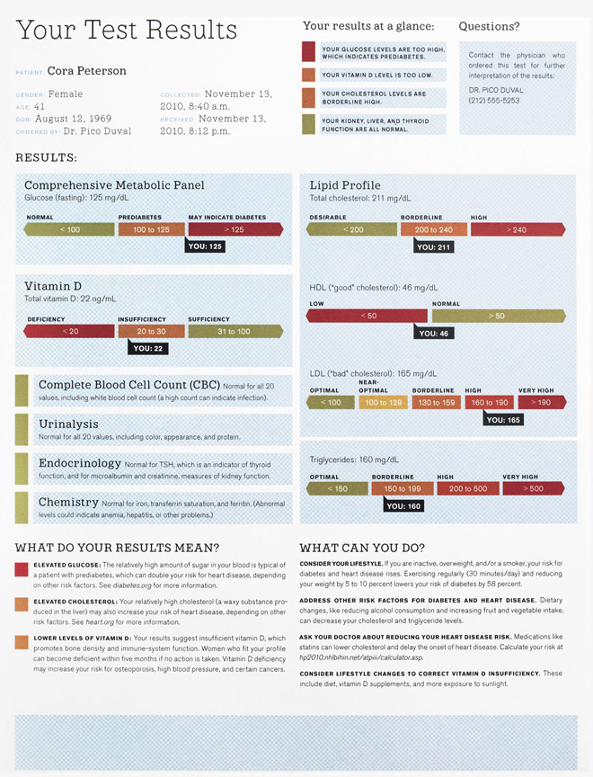
Listing various "reference ranges" on the right of the page, separate from the results, forces the eye to scan back and forth as you evaluate the numbers. We add charts that depict clearly and succinctly where you fit along the spectrum.
Make It Relevant
Information is useless without explanation and a call to action. So we augment this patient’s results with the relevant health risks and offer guidance about what the patient might do to improve her health.
Make It Simple
This printout is just the first of four dense pages. The original lists dozens of measurements, potentially too many for even a doctor to comprehend. We summarize the more esoteric tests, focus on the most relevant numbers, and add an overview at the top of the page.
Make It Clear
Doctors presumably know what high or low numbers might mean. But there’s no reason not to augment the data with qualitative interpretations for all results above and below "normal." Are your numbers a little low or a lot low? We explain.
Make It Colorfull
The ubiquity of color printers, email, and PDFs means there’s no excuse not to use one of the most effective tools in information design. We adopt a familiar green-yellow-red palette to make it easier to identify what needs immediate attention.
…Madeover
Click on the document below to view a larger image of the basic workup makeover.
Results redesign: Mucca Design

Blood report photos: Garry McLeod
The Heart Disease Test
Alongside cholesterol tests and high-blood-pressure monitoring, the c-reactive protein, or CRP, test is widely used to spot people at risk for heart disease, the leading cause of death in the US.
Personalize the Risk
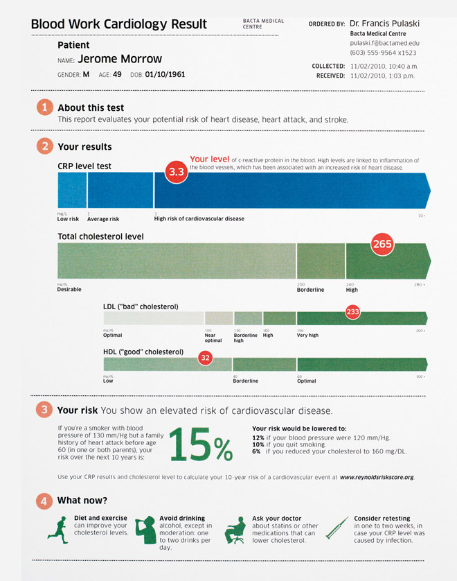
The phrase relative cardiovascular risk has little meaning without some context. An online calculator can combine the patient’s CRP result and lipid profile to estimate their specific risk. And we give them the URL to let them use it themselves.
Point to the Next Steps
The results are in. Now what? The original report buries advice on retesting in the fine print. We emphasize the point, explaining how a change in behavior (like eating better or quitting smoking) can reduce a patient’s risk of heart disease.
Give the Context
A doctor typically orders a CRP test based on the results of a lipid panel (which shows cholesterol levels)-then often orders the lipids again along with the CRP test. The two measures are used jointly to suss out a diagnosis or assess risk. So why not put them together on one sheet of paper? We do.
Describe the Test
The CRP test was invented by Paul Ridker, a Harvard medical professor, to measure c-reactive protein in the blood. High levels indicate inflammation, which can be a sign of infection or cardiovascular disease. Though there’s space galore on the page, this report makes no effort to explain the link between CRP and actual heart disease.
…Madeover
Click on the document below to view a larger image of the makeover of the heart disease test.
Results redesign: David McCandless

The Prostate Test
Short for prostate-specific antigen, the PSA test is one of the most common workups for men over 40-even though its reliability as a predictor of prostate cancer is controversial.
Keep It in Perspective
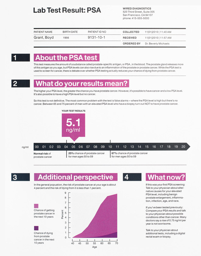
Even if he has a high PSA level, our patient’s chance of prostate cancer is just 25 percent. And even if he has the disease, there’s a 75 percent chance he’ll live 15 or more years-and a near certainty he’ll be alive in five years.
Give Specifics
Since the prostate produces more PSA as a man ages, some researchers argue that reference numbers should vary by age to avoid unnecessary biopsies. So while the original report shows just one range (0.0 to 4.0), we tailor the risk to our patient’s age group (50 to 59). Any lab could do the same.
Use the White Space
The original printout leaves most of the page blank. We put this fallow ground to use, adding more information and context.
Know the Controversy
Ablin called the overuse of the PSA test a "profit-driven public health disaster" in a recent New York Times op-ed. He says PSA screenings often lead to unwarranted, dangerous, and expensive biopsies. That won’t stop the test from being used-but patients should know that the results are often ambiguous.
Understand the Limitations
As the original report states, "PSA levels, regardless of value, should not be interpreted as absolute evidence of the presence or absence of disease." (Even Richard Ablin, the doctor who discovered PSA in 1970, says the test is "hardly more effective than a coin toss.") That’s why our revision includes helpful statistics (for example, 65 to 75 percent of men with a high reading do not have prostate cancer). We also list some of the many alternative reasons for an elevated PSA level.
…Madeover
Click on the document below to view a larger image of the prostate test makeover.
Results redesign: Jung + Wenig

|


